
Cover Snark (175): Always Room for Snark
posted at Thursday, February 18th, 2016 at 8:00 AM | Cover Snark, Other Bloggishness
Welcome to Cover Snark, where the people are snarky and the covers quiver in fear. Since I don’t write many snarky book reviews here on A Reader of Fictions, Cover Snark is my outlet. If you click on the title of the book, where possible, I’ve linked to Goodreads. Clicking on the cover itself will show you the cover in a larger size, in most cases. Feel free to love covers I hate and vice versa. Let me know your thoughts in the comments!
Please note that you should by no means contact the author if you do not like their cover; they likely have ZERO control. Feel free to express opinions in the comments, but please do not @ an author on Twitter because of anything you’ve seen here. Let’s keep it kind.
Shiny and New:
1. Into White - Randi Pink

Thoughts: LOVE the way they did this. The fact that the two heads are sharing a shirt is super cool. And the art is gorgeous.
2. On Through the Never (The Edge of Forever #2) - Melissa E. Hurst

Thoughts: As with the first in the series, the idea of the cover works way better than the actual execution.
3. Dreambender - Ronald Kidd
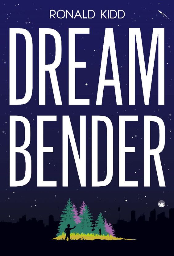
Thoughts: Clearly he’s using his powers to bring all of the moon’s light to his little patch of forest.
4. The Lost Cipher - Michael Oechsle

Thoughts: THE KID STARING AT THE BIG CAT THO.
5. Princess Juniper of the Anju (Princess Juniper #2) - Ammi-Joan Paquette
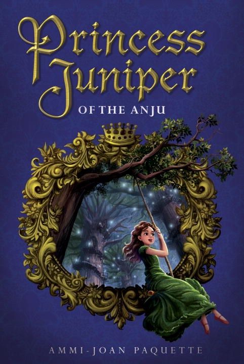
Thoughts: Serious Penelope vibes.
6. Into the Abyss (Falls the Shadow #2) - Stefanie Gaither

Thoughts: With all the grace of Alice falling to Wonderland.
7. Cruel Intentions - Scarlett York

Thoughts: You are setting a high bar for ridiculous sexy drama here, title.
8. Girl Last Seen - Heather Anastasiu & Anne Greenwood Brown

Thoughts: Her fashion icon is obviously Lizzie Bennet.
9. The Boy Who Killed Grant Parker - Kat Spears

Thoughts: Not sure what I’m supposed to be getting from this. Are the yellow lines indicative of sunshine? Of the hate of humanity for killing Grant Parker? Or is this Grant Parker’s body’s detailed chalk outline?
10. Morrighan (The Remnant Chronicles #0.5) - Mary E. Pearson

Thoughts: “Hmmm, what should we do for the novella cover?” “I don’t know, man. I’m busy.” “Me too. We could just slap the title font onto something.” “How about some greenery?” “EVERYONE WILL BE GREEN WITH ENVY AT OUR TALENTS. LET’S DO IT.”
11. Smart is the New Cool (Project Mc2 #1) - Jade Hemsworth

Thoughts: Is this how the youths are dressing these days?
12. Overdrive - Dawn Ius

Thoughts: This blur makes me feel like I’m drunk and driving around Vegas. Is this the intended affect?
13. Life Debt (Star Wars: Aftermath #2) – Chuck Wendig

Thoughts: A rey of cover sunshine.
14. All the Missing Girls – Megan Miranda

Thoughts: God, I told you guys they were all on the ferris wheel but you just didn’t listen.
15. Snack - Emme Burton

Thoughts: Oh my god, can you imagine how much it hurts having someone almost stand on point on your big toes? Also, because of the title, I assume she’s actually feasting on his face.
16. Pucked Over (Pucked #3) - Helena Hunting

Thoughts: Puck it, I’m laughing.
17. Always Room for Cupcakes - Bethany Lopez

Thoughts: I like the way you think.
18. The Weight of Zero - Karen Fortunati

Thoughts: Uhhhhhhh.
19. Lucy and Linh - Alice Pung

Thoughts: There’s an Asian heroine and the cover has a headless female figure. *growls*
20. Speed of Life - J.M. Kelly

Thoughts: Based on the cover, I’m guessing twins on a road trip with a baby. But…why are they a three-headed no-neck monster?
21. Scrooge #worstgiftever - Charles Dickens & Brett Wright

Thoughts: Once again, it’s shocking to me how much trouble I have parsing this. I am so old, guys.
22. Darcy Swipes Left - Jane Austen & Courtney Carbone

Thoughts: *swipes right*
23. Leave Me - Gayle Forman
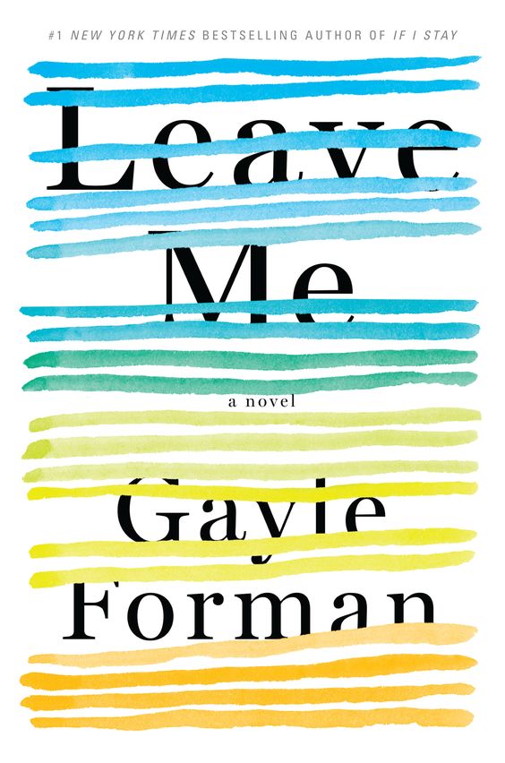
Thoughts: The strike-out affect on both title and author is an interesting choice.
24. A Darkly Beating Heart - Lindsay Smith
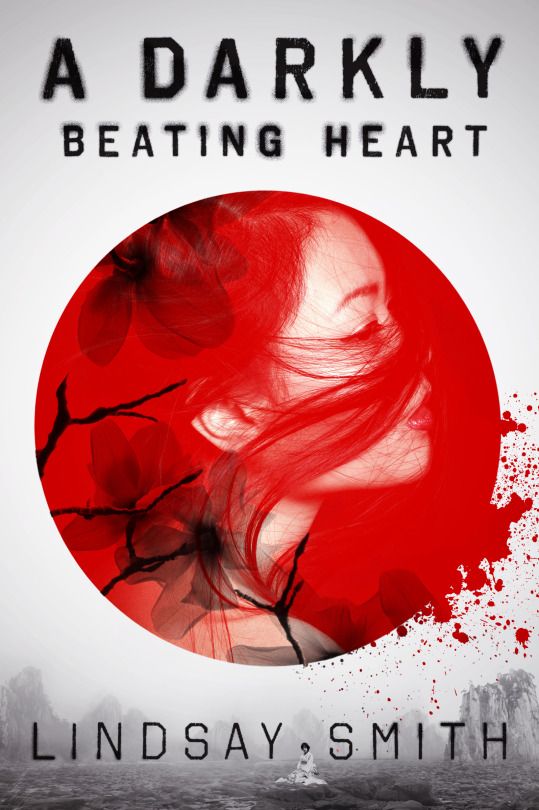
Thoughts: Yesssss, especially to the blood spatter.
25. The Moth and the Flame (The Wrath and the Dawn #0.25) - Renee Ahdieh

Thoughts: Shazi is the new black.
26. The Crown and the Arrow (The Wrath and the Dawn #0.5) - Renee Ahdieh
![]()
Thoughts: They didn’t really break their backs making these match, did they?
27. Girls in the Moon - Janet McNally

Thoughts: Girls in a microphone.
28. Unraveled (Elemental Assassin #15) - Jennifer Estep

Thoughts: Jennifer Love Hewitt???
29. Illusion (Heirs of Watson Island #3) - Martina Boone

Thoughts: They look like a happy couple on the cover, but that’s all an illusion.
30. Kids of Appetite - David Arnold

Thoughts: Tagline made me lol. Well done.
31. Frost - M.P. Kozlowsky

Thoughts: Cinder trying to give Jacin back his flower?
32. Nevernight (The Nevernight Chronicles #1) - Jay Kristoff

Thoughts: JAYSUS THIS IS BEAUTIFUL AND CREEPTASTIC. Shout out to Meg’s fonting brilliance! And obvs Jason Chan’s art is always ridiculously perfect.
33. Stealing Snow (Stealing Snow #1) - Danielle Paige

Thoughts: So it’s a shitty version of the Cold Spell cover?
34. Bright Smoke, Cold Fire (Untitled #1) - Rosamund Hodge

Thoughts: Hodge cover trademark = girl in a red dress. Not really liking the title font with the background, but I love the image.
35. Furthermore - Tahereh Mafi

Thoughts: This is technicolor busy-ness. My eyes don’t know where to look.
36. The Lovely Reckless - Kami Garcia

Thoughts: Even though they’re illustrated, that girl still has the scary blank stare of paranormal covers. But damn is that one hot illustrated dude. I mean.
37. Flicker and Mist - Mary G. Thompson

Thoughts: That tagline is hurting my head.
38. Everyone We’ve Been - Sarah Everett

Thoughts: Eternal Sunshine of the Fabulous Hair.
39. Been Here All Along - Sandy Hall

Thoughts: Neighbor boys falling in love? Here for it.
40. A Thousand Boy Kisses - Tillie Cole

Thoughts: If this doesn’t mean boys kissing other boys, I’m going to be very disappointed.
41. Ghosts in the Machine (The Babel Trilogy #2) - Richard Farr

Thoughts: Who you gonna call?
Cover Battles:
1. Golden Boys - Sonya Hartnett


Australian vs. US: There is a VERY similarly titled book with bicycles on the cover and it’s got a yellowy background. REALLY?


UK vs. US: I wonder if they drew the whole thing without lifting the pen from the paper. That would be cool.
3. The Lost and the Found - Cat Clarke


UK vs. US: I like the juxtaposition of her as a trusting kid and a found teen. Way more creative than just slapping some police tape on it.
4. Girl on a Plane - Miriam Moss


UK vs. US: I am experiencing turbulent indecision.
5. Illusionarium - Heather Dixon
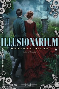

US Hardback vs. US Audiobook: That is super cool. Def prefer the audio, which is weird because they often get really terrible covers.


US Original vs. US Redesign: The original cover did rather date itself, didn’t it?
7. More Happy Than Not - Adam Silvera


US Hardback vs. US Paperback: More paint-splattered than not.
8. The Wrath and the Dawn (The Wrath and the Dawn #1) - Renee Ahdieh

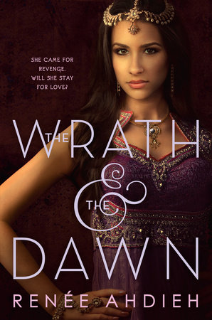
US Hardback vs. US Paperback: I like the hardcover, but lbr more Shazi cannot ever be a bad thing.
9. The Map of Bones (The Fire Sermon #2) – Francesca Haig


US vs. German vs. UK: Sorry bird and fakely-burning Greek letter, the UK has it.
WTF of the Week:
WTF of the Week began as a special category for one cover I saw, but was so popular it became a recurring feature. Here, I highlight covers, both new and old, that I’ve found, which, upon viewing, made me either snort or say something along the lines of “Dear God, what is that thing?”
1. Punk Rock-a-Bye Baby (Radical Rock Stars #5) - Jenna Galicki
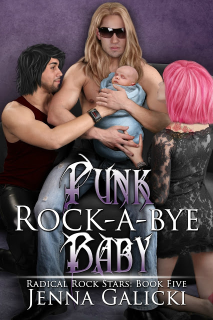
Thoughts: The internet is full of such treasures.
2. Everyday MOMents: Discovering Christ in the Details of Motherhood - Jessica Poe

Thoughts: Naked family snuggle time is how you discover Christ. TIME FOR THE BRAIN BLEACH.
3. Max - Sarah Cohen-Scali

Thoughts: I am so fucking not okay with this cover.


I’ve missed Cover Snark!
-the font on the Rosamund Hodge cover = dislike
-the feet on the Snack cover look like they’re two different skin colours because of the shadow, I had to do a double take
-Sandy Hall cover = simple, but lovely. Also, I’m here for the gay neighbour boys love story!
-the last cover = WTF of the YEAR!
I think I’d like that Hodge font a lot on the right book, but it definitely does not work here.
Very curious about the Sandy Hall! Want it just for the cover. :-p
Thanks a lot, #14 made me do a very-real spit take over my laptop! Definitely missed Cover Snark <3
<3<3<3
1. I love this cover too! From what I’ve read of the synopsis it seems to fit really well.
4. Hahah you always notice the best details.
5. Ooh I love this cover! Which reminds me I never finished the first book… whoops. It was cute though.
10. Yeah it’s pretty but also lazy. And it makes me think of Ireland, between the clovers and the name.
11. Maybe on Disney Channel and Nick…. where they still don’t actually dress like that IRL. Ugh. Haha.
19. Laaaaaaame. Grr.
32. It’s so creepy!!! Ahh! Love that Meg did the font 😀
33. Very underwhelming.
34. I wanted to love this more than I do. I think it’s the font. Too blocky.
36. I actually really like this, I’m surprised! Hot illustrated guys are always a win.
39. Yesssss so cute, reminds me of the T Swift video for You Belong With Me. I can’t wait for this!
1. Agree that the cover seems to fit the synopsis perfectly. I’m still scared of how many ways that premise could go wrong, but I’ll be watching reviews.
4. Still not over that chubby kid’s face.
5. I’d never heard of the series, but I really love the swinging and the dress and her shoe game and the fairy lights.
11. :-p They are some outfits.
19. Why must they keep doing this?
32. Super creepy. Every time I look at it, my first thought is DEAR GOD NO, but then I stop and appreciate how everything is perfection. I love Meg’s font obvs, but I also really love the stripey pants, which is a random detail but still.
33. I’d say it’s under underwhelming, but considering that she supported KH, I hope they don’t fix the horrible cover.
34. The font just really doesn’t fit with the mood of the cover for me, though I can’t necessarily explain why.
36. It’s not my favorite personally, but I do appreciate the art. It just doesn’t look like it would be a book I’d enjoy, even if the cover’s pretty, which sort of turns me off to the cover in turn, if that makes any sense.
39. Not sure if I’ve actually seen that. My knowledge of pre-1989 T Swift is basically non-existent.
5. I picked it up on a whim at ALA last year, I hadn’t heard of it either.
33. Hahaha touche.
39. Oh it’s so cute! She’s a nerdy girl in love with her neighbor/friend and they communicate through their windows that face each other (like every good YA book/teen movie haha).